Saturday, September 02, 2006
Don't always believe what you see
This article on News.com demonstrates how easy it is to fake a photo, and who is willing to do it to make their point. There's a blurry line between illustration and photography, and it's tempting to cross over that line when you want to show something in the way you see it, regardless of how it really looked. It's incredibly irresponsible to do this without a big disclaimer, and probably just bad practice because it can lead to unintentional consequences (ie: people think it's a real photo).
Sunday, August 13, 2006
Shiny New Backdrop Tutorial
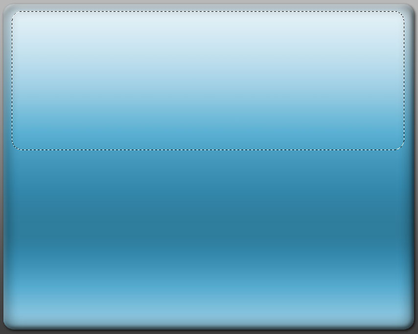
 Here's my backdrop for today. I spent a while trolling online tutorials for "glass style" designs. Some are pretty hard to understand, and you don't really get why you're doing what they say. It helps to understand the physicial effects as much as what steps to do in PhotoShop.
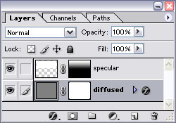 The glass look is a combination of two layers. One is the base, which has highly diffused lighting. It gives the surface its overall color and shading. The top layer is a shiny, very reflective sheen.
I'm a fan of using layer styles versus "old school" gradients and layers made with filled pixels. They scale better and are easier to change. Now smart objects can make things even more adjustable.
The base layer has a layer style which makes whatever color the pixels are in the layer itself irrelevant except for opacity. It can also be applied to a shape object.
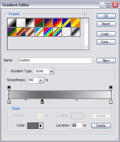 There's a gradient in normal mode (that's what completely covers the pixels) that I tweaked a bit. It goes from medium to dark, to light, all grayscale. The medium gives the bottom of the object a little lighting which works great for beveled objects. The dark color stop is at the 33% position.
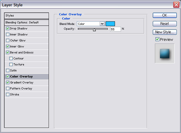 Then I use the color overlay setting to add color. Mode set to color, at about 45%.
 Most glass style items are beveled. It helps give them dimension. The bevel size depends on the size of the object. Mine is 8, with soften set to 14.
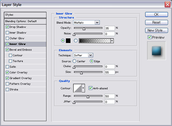 Then I throw on inner glow for good measure. Change the mode to multiply and color to black. Opacity 35. Size really high so it's fuzzy (mine is 55) and 0 choke.
If you're making a button, add a drop shadow. That's the base layer.
 The top layer relies on the shape more than the layer style. It needs to be a more rounded version of the overall shape, covering no more than 80% of the top half. The smaller the more spherical the illusion of the object. A bevelled button would have essentially a rounded corner box. A sphere would have a small circle. Full white fill. Overlay mode at 25% fill.
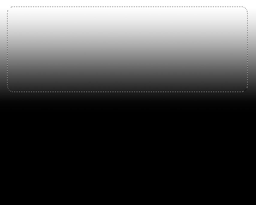 For a bevelled button, it might help to add a layer mask and give the top layer a gradient transparency with 100% at the top of the visible area and 15% at the bottom. This makes the layer more subtle, and resembles the effect that the specular highlights are more visible at certain angles (usually closest to the more rounded/angled part of the surface).
Here's the final, bevelled button:
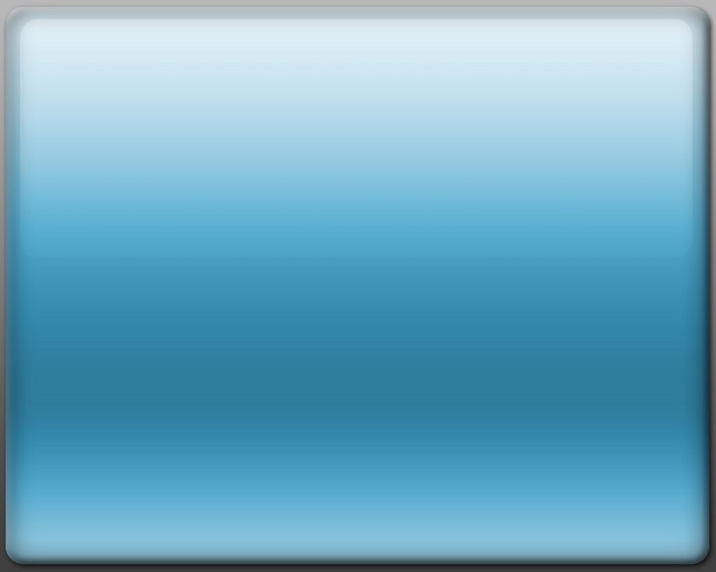 To make this a backdrop, I cropped away the edges that had the bevel and inner glow.
I'm not sure why I went through all the detail for this design since there are tons of glass button tutorials out there. But I wanted some practice writing.
Tuesday, July 25, 2006
ART BACKWASH: A Day in the Life of a Designer.
There's a saying in the design industry: "Time, Quality or Cost- pick any two." Well there's always one more thing you get, and it's usually for free, sarcasm.
Von Glitschka has a funny but all too realistic story about dealing with clients who like to be back-seat designers in this article: ART BACKWASH: A Day in the Life of a Designer.
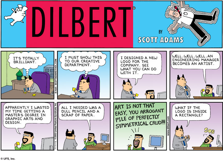
I dug up this this Dilbert which also makes a similar point.

Von Glitschka has a funny but all too realistic story about dealing with clients who like to be back-seat designers in this article: ART BACKWASH: A Day in the Life of a Designer.
I dug up this this Dilbert which also makes a similar point.
Monday, July 17, 2006
Stopdesign gets Googled Up
A site I visit occasionally for design inspiration is Stopdesign. They did the 2nd generation of Blogger Templates, one of which I'm using (Tic Tac Blue).
I checked it tonight and found this message:
The cat’s out of the bag. I made the announcement here in New Zealand at Webstock, so I’ll confirm that, yes, the rumors are not just rumors. After a bit of negotiation and a lot of internal debate, I recently accepted an offer to join Google as Visual Design Lead, a position that did not previously exist there. I’m charged with helping the company establish a common visual language across all their collaborative and communication products. This includes products I’ve already had some hand in like Blogger and Calendar. But it will also include other highly used products like Gmail, Writely, Page Creator, and other projects in the pipeline.
You can read the full article here. I hope he keeps posting cool designs and articles, and wish him best of luck!
Tuesday, July 11, 2006
Really cool 3D Chalk Art

Artist Julian Beever is at the Just for Laughs comedy festival in Montreal. He does 3D chalk drawings that have realistic perspectives of objects, people or things. Just from the photos they look amazing- I can't imagine what they look like in person.
His website is http://users.skynet.be/J.Beever/pave.htm.
Monday, July 03, 2006

Wednesday, May 03, 2006
More "Where did that font come from?"
Here's another useful list - fonts bundled with Adobe Creative Suite products.
The CS2 package contains:
*Garamond Premier Pro only available via download to registered users of the Adobe Creative Suite.
The CS2 package contains:
- Adobe Caslon Pro 6 fonts
- Adobe Garamond Pro 4 fonts
- Adobe Jenson 4 fonts
- Adobe Woodtype Ornaments Std 1 font
- Bernhard Modern Std 4 fonts
- Bickham Script Pro 3 fonts
- Birch Std 1 font
- Brush Script Std 1 font
- Caflisch Script Pro 1 font
- Century Old Style Std 3 fonts
- Chaparral Pro 8 fonts
- Charlemagne Std 2 fonts
- Courier Std 4 fonts
- Garamond Premier Pro 34 fonts*
- Giddyup Std 1 font
- Letter Gothic 4 fonts
- Lithos Pro 5 fonts
- Mesquite Std 1 font
- Minion Pro 6 fonts
- Minion Std Black 1 font
- Myriad Pro 10 fonts
- Myriad Pro Condensed 10 fonts
- Myriad Wild Std 2 fonts
- News Gothic Std 4 fonts
- Nueva Std 6 fonts
- Poplar 1 font
- Prestige Elite Std 4 fonts
- Rosewood Std 2 fonts
- Stencil Std 1 font
- Trajan Pro 2 fonts
- Viva Std 3 fonts
- Warnock Pro 32 fonts
- Adobe Ming 1 font
- Adobe Myungjo 1 font
- Adobe Song 1 font
- Kozuka Gothic Pro 6 fonts
- Kozuka Mincho Pro 6 fonts
- Ryo Display 5 fonts
- Ryo Text 4 fonts
Monday, May 01, 2006
Signage that says "Please Deface Me"
Sometimes an ad design has unintended meaning. Sometimes they just don't work. But would you design an ad that just begged to be defaced? I doubt these two are intentional, but I've seen all kinds of creative additions to them.
This forest fire prevention one has had several names added. Use your imagination. :)
 |
| On this one I've seen a big smile, a Mister Bill "Oh Noooo", and a Rolling Stones style lips & tongue. |
 |
Monday, March 27, 2006

Monday, March 20, 2006
See what Flash can really do!
http://incomplet.gskinner.com/
Particle effects, real-time interaction with live inputs. Really amazing stuff.
Particle effects, real-time interaction with live inputs. Really amazing stuff.
Where did that font come from?
Sometimes I'll look at a font and wonder where it came from- Did a piece of software install it? Did someone send it to me?
Here is a list of fonts installed with Microsoft Office. And another good page on MS's website about fonts included with other products and typography in general.
Adobe has an extensive type library. Many of the best original font desings are theirs, but you can find knock-offs. The other great source is Monotype Corp. Sure there are lots of free fonts out there, but you get what you pay for.
Years ago I helped design a font for a user interface. It's a fun but tedious process. You have to hand-tweak every letter and make sure that all possible combinations of text look natural. Here's a company, Ascender Corporation who has done similar work.
Bad Fonts
Alot of people use Arial. Simply because it comes with Windows. It's not too bad, but there are much better sans-serifs out there.
The worst font when over-used is Comic Sans. There is even a Ban Comic Sans website.
The worst font when over-used is Comic Sans. There is even a Ban Comic Sans website.
Sunday, March 19, 2006
Good Fonts
CreativePro has another good article on Fonts.
Here's what they suggest as good typestyles to start with:
Here's what they suggest as good typestyles to start with:
Serif typefaces
- Minion
- Sabon
- Adobe Caslon
- Georgia
- Stone Serif
San serif typefaces
- Meta
- Frutiger
- Myriad
- Verdana
- Stone Sans
Frog Design
Frog Design is a very prominent and influential design company. They've designed logos and adverts as well as products.
You can see their projects on the Frog Timeline.
You can see their projects on the Frog Timeline.
Clearview
Frutiger is a font designed for signage. It was invented specifically for the Charles de Gaulle Airport in France.
Now there's Clearview. Here's an article about on CreativePro.
Now there's Clearview. Here's an article about on CreativePro.
Style vs Design
Adobe has a nice article about Style vs Design. Sometimes it's hard to tell the difference. :-)
Subscribe to:
Comments (Atom)